10 Lightweight Best CSS Frameworks That You Can Use In Your Next Projects

Full Stack Web Developer / SAAS Developer / Specialised in Laravel,WordPress,PHP,Javascript,VueJS, Dart & Flutter.
Best CSS frameworks are hard to find. A big portion of the developer’s time is spent on creating beautiful CSS. Thanks to lightweight CSS frameworks. Now everyone has a faster, better, and more effective way to create responsive web applications and websites.
If you are looking for the best CSS frameworks, then you are in the right place. Here, I have listed the 10 best CSS frameworks. All of these lightweight CSS frameworks are perfect for any sort of project. Why not check out these minimal CSS frameworks and give a try?
Well, let’s find out, but before, let’s discuss a little bit about ‘What is a CSS Framework?’ for beginners. So they can get a whole bunch of ideas about lightweight CSS frameworks.
What is a CSS Framework?
A simple CSS framework is a library that allows easier and more standards-compliant web design using Cascading Style Sheets language. It offers different modules and tools. They provide generic functionality that can be overridden for specific applications and scenarios.
Best CSS Frameworks
Pure CSS

Pure CSS is nothing else but a set of small responsive CSS modules that you can use in your every web project. This is one of the best CSS frameworks which is very tiny; the entire set of the module is 3.7KB (gzipped and minified ). It is crafted with keeping mobile devices in mind. Every line of Pure CSS is carefully considered, and it was very much important to keep the file size small.
You can save more bytes, only if you decide to use a subset of these modules. Pure CSS is entirely responsive; therefore, all elements of this framework will look great on all screen sizes. By using Menus, Grids, and more, you can create beautiful responsive layouts for all screen sizes.
Take a look at some different layouts of Pure and then start your next web project with a rock-solid foundation. Unlike other frameworks, the designs of Pure minimal CSS framework is flat and unopinionated. By adding a few lines of CSS, you can entirely customize Pure CSS’s appearance to work with your web project.
Pure responsive CSS framework builds on Normalize.css and provides you layout and styling for all native HTML elements, plus all the most common UI components. It’s like what you need without the cruft. Pure arrives with minimal styles and encourages you to write your application styles on top of it. It is designed in a way to get out of your way and make everything easy to override styles.
mini.css
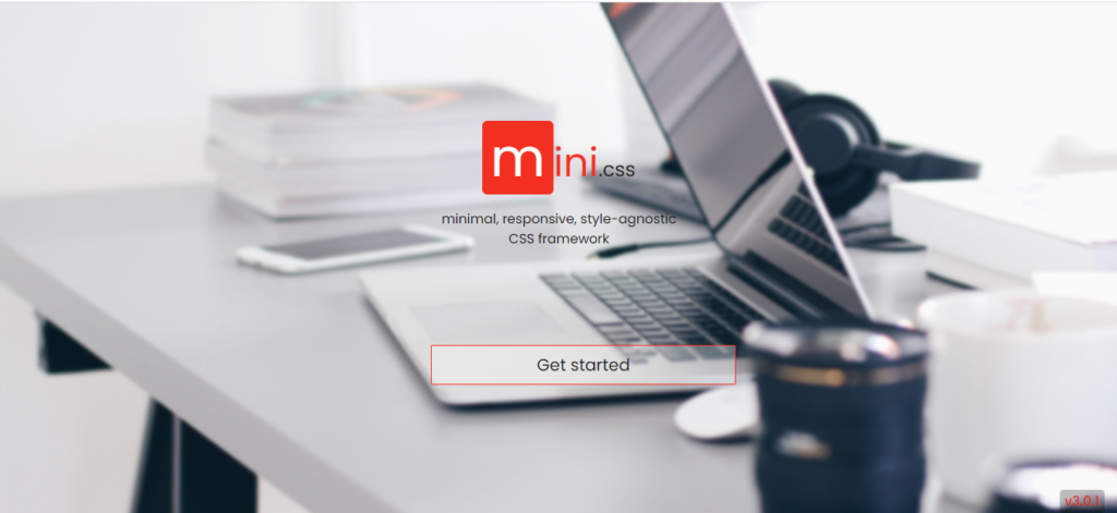
Mini.css is considered as one of the best css frameworks and cleanest tools for creating attracting websites that will load blazingly fast on mobile connections on any device. Its size is very small (below 10KB gzipped), besides its modern elements and responsive grid guarantees that all your users to be happy and reach your website at any time, anywhere.
Linking the gap among full-featured frameworks (e.g., Semantic UI, Bootstrap), and micro frameworks (e.g., Pure.CSS and Milligram), mini.css comes with many points in a tiny package.
This framework relies on CSS, suggesting you don’t have to bother about any sort of conflicts with other Javascript libraries you might be using.
Creating a simple CSS framework yet powerful framework that fulfills everyone’s requirements is not a simple task. But mini.css succeeds to progress to the occasion by implementing consistent and far-reaching documentation in succession with examples, templates, and semantic HTML5 markup.
You can install mini.css in 3 ways. 1. Via NPM npm install mini.css or yarn add mini.css, 2. By using the cdnjs to link to mini.css stylesheet, 3. By using the Github repository to get the latest development version.
Milligram
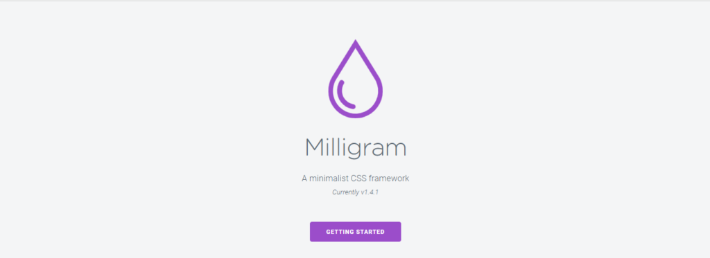
Milligram is one of the best CSS frameworks that comes with a minimal setup of styles for a neat and swift starting point. Its only 2kb gzipped. Despite being small, Milligram minimal CSS framework comes with a complete set of web development tools.
This lightweight CSS framework is specially designed for higher productivity and better performance with fewer properties to reset that results in cleaner code. Milligram responsive CSS framework is widely used. In fact, some of the big companies like Airform and The Node.js Foundation are also using this simple CSS framework.
To get started with Miligram lightweight CSS framework, first download with the most suitable option. Then add the main file of the Milligram, and the CSS Reset in the header of your project and that’s all. You can install Miligram with Bower ($ bower install milligram), with npm ($ npm install milligram), and also with Yarn ($ yarn add milligram).
Once you download the milligram minimal best CSS framework you have to extract the compressed folder to see the uncompressed main file and minified version. Milligram responsive CSS framework comes with complete documentation. If you are stuck anywhere, just browse their site and check the documentation. Then you will be able to solve your problem by yourself.
Simple Grid
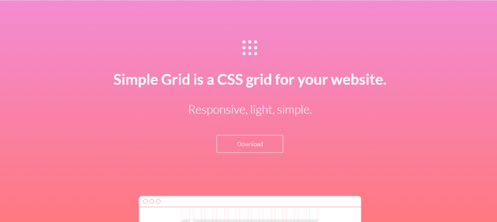
Simple Grid is one of the responsive 12 columns, best lightweight CSS framework grid that helps you to quickly build responsive websites. All you have to do is download the CSS stylesheet and add all the appropriate classes to your markup. Then you are off to the races, and it’s that simple.
In Simple Grid – best css framework, each column is contained within rows, and those are contained within a container. The maximum width of the container is set to 960px, but if you want, you can edit without having anything to break.
All the codes in the Simple grid is kept simple and familiar. For defining the number of occupied columns, simply state the number of columns. This CSS framework is built mobile-first; therefore, all the columns will expand to the container width even on the smaller screens. If you don’t want columns to expand on small screens and mobile devices, just add -sm to the end of your column class name.
Simple Grid minimal best CSS framework uses Lato from Google fonts as a base font family, and its size is based on root em units. The download package of Simple Grid now contains an SCSS file for those persons who prefer SASS as well. The best part is, it is open-sourced and comes under the MIT license which means you won’t have to pay a single penny.
Skeleton
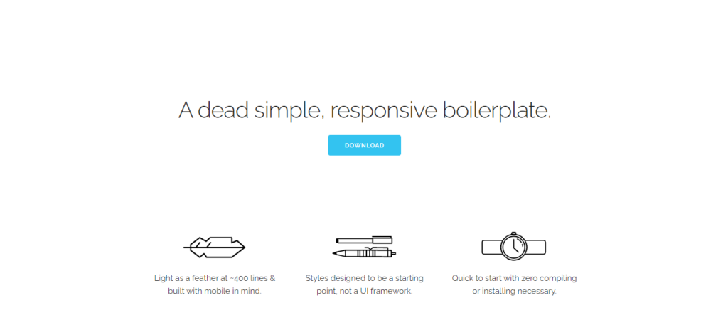
Skeleton is a very minimal, responsive, and one of the best CSS frameworks which arrives with only 400 lines of source code. Can you believe that? Despite being relatively small size, Skeleton CSS framework offers a lot of options such as (grids, buttons, typography, lists, forms, code, tables, etc.) that allow you to create any type of complex website.
If you are doing a small project, there is no necessity to increase the burden by using a larger framework. In this case, the Skeleton css framework is the perfect framework for your project. Skeleton css framework features only a limited number of standard HTML elements, but that’s enough to get started.
Skeleton css framework provides a 12 columns fluid grid with a maximum width of 960px; that will shrink with the device size. No matter if your website is viewed on smaller or mobile devices, it will always look stunning on each and every device. If you wish you can change the maximum width with one line of CSS, then all columns will resize accordingly. The syntax is very simple, and it makes coding very much easier and responsive.
Skeleton CSS framework comes with demo landing pages; if you really want to watch before trying out this framework, you can do it from here. More demos are coming soon.
Picnic CSS
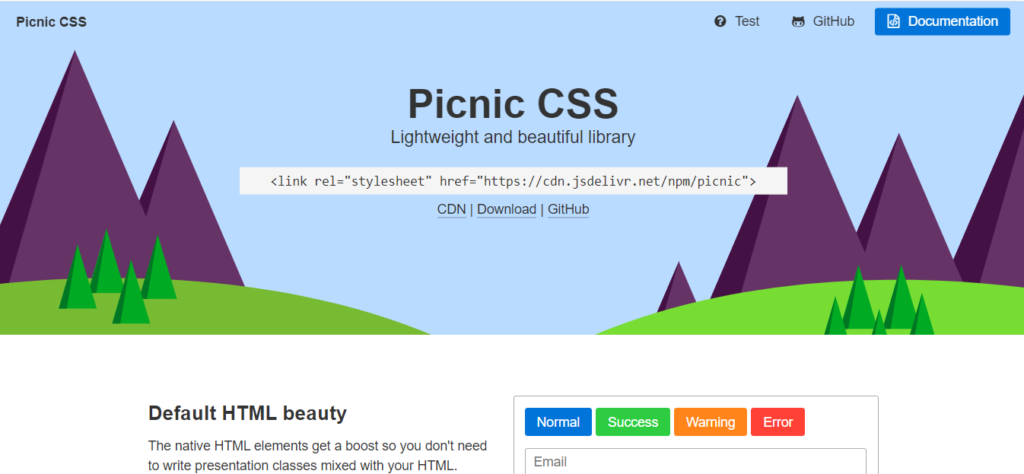
Picnic is one of the invasive CSS libraries to get started your website style. This framework’s main purpose is to provide you compressed CSS file under 10kb for quicker and reliable mobile shots. Picnic CSS is written in SCSS with multiple classes (placeholders) and variables to make it straightforward to extend.
This is one of the best css frameworks and is entirely modular; therefore you can effortlessly test and adjust each element in the way you like. Get the best practice for your userbase with various complex and meticulously crafted CSS transitions. With Picnic CSS, native HTML elements get a big boost, so you won’t have to write any presentation classes mixed with your HTML.
Picnic CSS is completely open-sourced; therefore you won’t have to buy it or invest any single penny to get it. This license will allow you to use Picnic CSS in a huge variety of projects.
This best CSS framework is for hackers. Install it with bower, and you will be able to integrate Picnic to your project and make it work for you. You can install Picnic CSS in 3 ways. 1. Via NPM yarn add picnic or npm install picnic, 2. Use jsedelivr to link to picnic.min.css stylesheet, 3. Use the GitHub repository to get the latest development version.
Wing
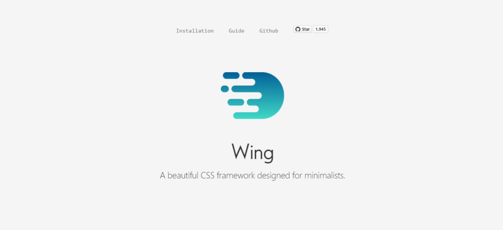
If you are looking for a beautiful, best CSS framework for a minimalist, wing lightweight CSS framework is just created for you. This framework arrives stuffed with stunning features, including styling for most utmost components, a grid, and some of the elements, all in within just 5kb.
Every design that comes with Wing lightweight CSS framework is modern and clean. Dropping it into your project will provide you a headstart in design. All you have to do is drop the Wing CSS framework into your project, and everything will be styled automatically. In Wing, here is only a minimal amount of classes to learn.
The styles of Wing is based on rem units. All rem units are converted to base 10; therefore, 10px is equal to 1rem. By default, all paragraphs, all headings, and code of wing use system fonts using the most modern one available on a user’s OS.
Wing provides you with a minimal 960px, 12 column grid along with intuitive class names. The wing comes with an MIT license; therefore you get this absolutely free. Wing CSS can be installed in 3 different ways. You can either manually install this best css framework from CDN or use package managers 1. Via NPM npm install wingcss or yarn add wingcss, 2. Use cdnjs to link to wing.min.css stylesheet, 3. Use the Github repository to get the latest development version.
Chota
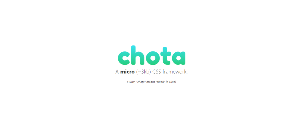
In English, there is no meaning for ‘Chota.’ But in Hindi, ‘Chota’ means ‘small’. Chota is a very tiny and one of the best lightweight CSS frameworks. If you ask about the size you may get astonished; its only about 3Kb (minified + gzipped ). It doesn’t require any preprocessors therefore all you have to do is, drop Chota is your project and play.
Chota arrives with a handful of components and utilities like a 12 column grid. It also supports icons out of the box as well. Simple to extended, thanks to CSS variables.
You can install Chota is three different ways. 1. Via NPM npm install chota or yarn add chota, 2. Use cdnjs to link to chota.min.css stylesheet, 3. Use the Github repository to get the latest development version.
SPECTRE.CSS
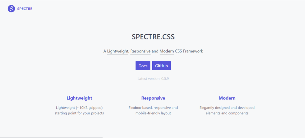
Spectre.css is a very responsive, lightweight, (less then 10KB gzipped) modern, and one of the best CSS frameworks. This framework is created for faster and extensible development. A beginner-friendly lightweight framework for your projects.
Spectre is flexbox based and comes with elegant, designed advanced elements and components. It provides basic styles for typography, pure CSS components, and utilities with best coding practices. This CSS framework is MIT license based therefore, you won’t have to purchase this framework.
If you like their work, you can always donate to the Spectre team or sponsor via Patreon. Spectre CSS can be installed in 3 different ways. You can either manually install this framework from CDN or use package managers 1. Via NPM npm install spectre.css or yarn add spectre.css, 2. Use cdnjs to link to spectre.css stylesheet, 3. Use the Github repository to get the latest development version.
minireset.css
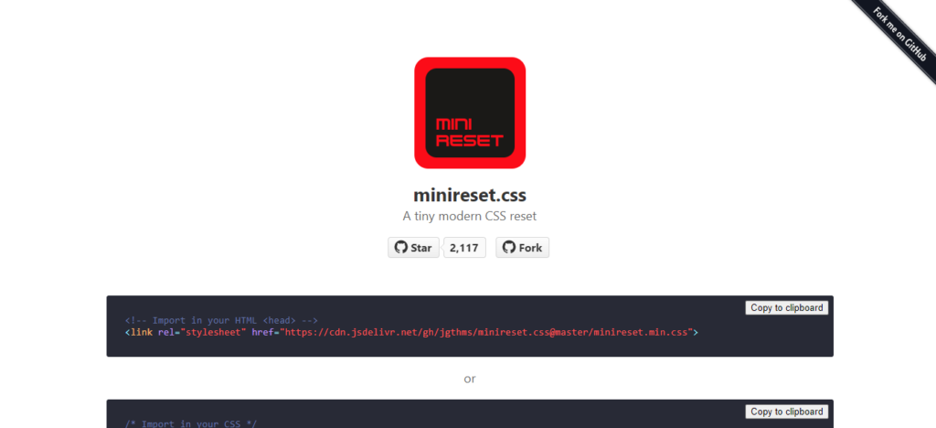
Minireset CSS is one of the best css frameworks that comes with a very tiny size and modern facilities. If you don’t like any default styling of your site, reset everything with the help of minirest.css. It will reset your font sizes, so using semantic markup won’t have any effect on styling.
You will be able to reset block margins along with tables; therefore spacing will be only applied when you need it, and tabular data will only be applied when you need it. Minireset CSS will preserve all the inline paddings so all the buttons and inputs will keep their default layout.
The borders and paddings won’t affect the set dimensions in minireset as it sets the border-box box-sizing. Minireset CSS comes with entirely responsive media elements; all of your videos and images will scale with the browser width.
minireset CSS can be installed in 3 different ways. You can either manually install this framework from CDN or use package managers 1. Via NPM npm install minireset.css or yarn add minireset.css, 2. Use cdnjs to link to minireset.min.css stylesheet, 3. Use the Github repository to get the latest development version.
Final Words
So have you chosen your lightweight CSS framework? Let me know which one you choose. If you liked the post, don’t forget to share it. Share your thoughts through the comment box. I will be happy to answer them.
Leave a Reply Cancel reply
Your email address will not be published. Required fields are marked *
Comment *
Name *
Email *
Website
Save my name, email, and website in this browser for the next time I comment.